Tuesday, 18 November 2014
Book cover : Image
This was the first image I randomly got from http://www.flickr.com/explore/interesting/7days when I downloaded it I thought about the image and if I could change anything such as the colour or the look of the image slightly.
First, I started with the saturation because the title of the book is called "I did it with integrity"
So I decided that i would make the wall of the picture quite bright which could insinuate that maybe the main character has killed someone.
Monday, 17 November 2014
Friday, 14 November 2014
Stage 3
The font is really important factor that is why I left it till last because I wanted to see how the rest of the logo would turn out. Using word I looked at range of different fonts that would help decide which one goes with the logo and the theme which relate back to the film Harry Potter.
Between Apple chancery and Wide latin, those were my two choices of fonts:
Apple chancery:
Wide latin:
In the end I chose Apple chancery font for the banner however I could not use the other font because it looked very stretched out. Also I could not use the same font for the banner around the circle because it did not look very good so I used Nueva STD instead.
After I had decided on the font to use I thought the logo still looked quite boring so I decided to add some illustration to it by put a top hat on one side of the banner and a bunny rabbit coming out of it to highlight that it is a magical joke shop.
Stage 2
Inside the circle I had two ideas either : put a wand inside the circle that would cross each other and the put the letter W inside the 4 blank spots that the cross had made. Reflecting the name of the brand 'Weasley Wizard Wheezes'.
Or the other idea was just to put multiple W's to fill up the inner circle to represent the brand.
In the end I decided to go with using two wands:
But the image of the face was too big so you cannot see the letter 'W' or the wands so I took this out and decided to keep it plain for now. The next stage was to sort out how the placing of the words and it's display. So I spread the logo around the circle and added in the extras points that the joke shop has to offer. But when I was spreading the words around the writing was upside down so I tried to write it the other way by adding layer so that when people read they will not find it difficult.
Eventually I decided that I would put the extra points about the joke shop around the circle instead and keep the picture in the middle with nothing the background and make a banner, which would display the name of the logo.
Sunday, 9 November 2014
Stage 1
In the beginning I found it difficult to figure out what would go on the logo whether it would be all writing or I would use the idea from other logos to use the face of the Brothers. But eventually I used the idea of the face and once I had found the picture I used Photoshop to help edit the picture a little using the lasso tool and some airbrushing.
In Illustrator I used a vector which helped me to highlight different parts of the face and change the colour and look of the image. However I felt that the vector limited certain things I wanted to do with the colour on the image.
But so far:
As you can see on the Image I have highlighted apart of the image to see how the vector has pinpointed certain parts of the face the limitation is really because the smaller parts that you can see on the image are harder to put colour on that's why the image still looks half unfinished because I am deciding whether to leave it as it is or continue adding more colour and shade.
Besides the image I thought about How I am going to input the writing : the logo and the extra information about the joke shop. At first I was just going to use the head and put the writing at the bottom and the top but that would look disorganised so decided to make a circle to make the basis of the design and put the face inside.
The colour choice of the circle was orange and grey because I felt those two colours who compliment each other because looking at the earlier research I did on many of the logos for the joke shop orange was an essential colour to use. I chose Grey because I felt that the orange is a bright colour and matching it with grey which is a quite neutral colour would help the writing and the central image to stand out.
Friday, 7 November 2014
Inspiration for my logo
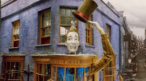
The inspiration for my Logo came from the fictional film Harry Potter. In the film two of the main characters the Weasley brothers made a joke shop called the 'Weasley Wizard Wheezes'.
 Using both of these images gave me ideas to construct a logo for the Weasley brothers joke shop. The main parts of both logos that seemed necessary to use in the logo was:
1. Face of the Weasley brothers
2. The extra headline telling me what they give sell at their joke shop
3. The importance of how the name of the logo is displayed.
Subscribe to:
Comments (Atom)


